Gestalt psychology is founded on the assertion that man envisions patterns in a manner that informs their perceptions of reality.
This school of thought holds that people perceive pieces of visual information, such as symbols and shapes, in accordance with their configuration, pattern, or organization.
Essentially, the whole pattern is more descriptive than the sum of its distinct parts.
Gestalt’s ideology is founded on the assumptions that humans perceive objects in their simplest form and can follow patterns naturally.
Gestalt’s Law of Proximity
There are several laws used to formalize Gestalt’s hypothesis, among them Gestalt’s principle of proximity.
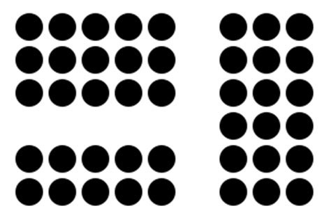
Also referred to as the grouping principle, this concept stipulates that humans perceive objects that are in close proximity to each other as a group.
It states that the close positioning of visual elements in a group signifies a relationship between these distinct parts, thus rendering a particular meaning to that arrangement.
Examples of Gestalt’s Law of Proximity
This law is used in various real-life instances. Examples include:
1. Braille

This tactile reading and writing system is purposely designed for use by visually impaired persons.
It features a series of raised dots printed on refreshable braille displays or the more traditional alternative, embossed paper.
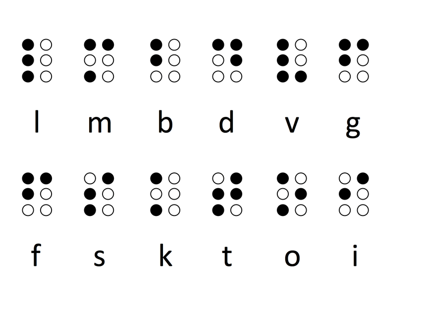
The dots are positioned in different arrangements within a braille cell, with each arrangement signifying a different character.
In accordance with Gestalt’s law of proximity, braille readers are able to make sense of these dot arrangements due to their close proximity.
For instance, the dots that make up the letters ‘l’ through ‘i’, as detailed in the figure above, are all placed in different close-knit arrangements.
These arrangements are considered to have different meanings since each grouping comprises dots that are grouped close to one another.
2. Automobile Interior

Another area where Gestalt’s law of proximity is applied is in the automobile industry, particularly in the interface designs.
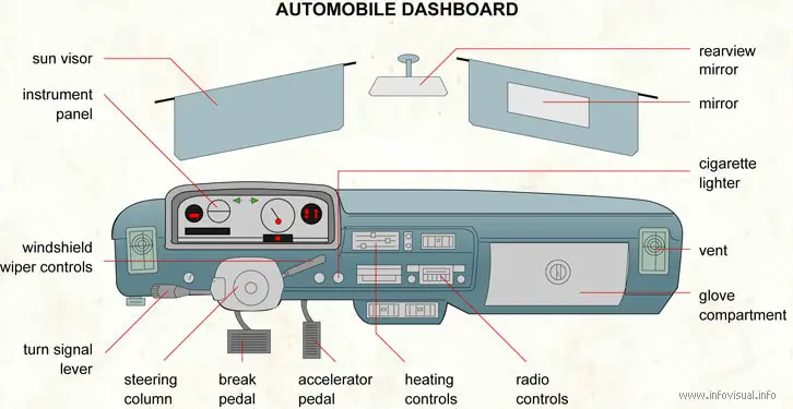
All vehicles are designed with the driver’s safety and convenience in mind. As such, all elements of a car’s interface are arranged in terms of proximity to allow for convenient handling even in stressful situations.
Controls for related functions are grouped together to make it easier for drivers to find these elements while driving.
For instance, all driving controls, such as the turn signal lever and windshield wiper lever, are grouped close to the steering wheel.
Similarly, light indicators including the speedometer, fuel gauge, and odometer are closely packed together at the dashboard panel, while driving pedals are grouped together at the driver’s feet.
Also, entertainment-related controls, such as the radio and lighter, are strategically placed in close proximity at the automobile’s middle console.
3. IBM Logo

Some companies have also used Gestalt’s law of proximity as the basis for their creative logo designs.
A notable example is the IBM (International Business Machines Corporation) emblem which features several small horizontal lines placed in three different arrangements, each representing one of the three letters of the company’s name.
Gestalt’s law of proximity notes that humans render distinct meanings to different groups of elements depending on their arrangements.
This idea is applicable in IBM’s case since the horizontal lines used for the corporation’s emblem are stacked in three unique groups and uniform gaps used to intersperse them.
This creative configuration enables people to differentiate between the lines that represent ‘I’, ‘B’, and ‘M’.
4. Football Lineups

This psychology theorem of proximity is also a critical tenet of tactical planning in sports.
Team managers, especially in soccer, use proximity-based arrangements to categorize different teams.
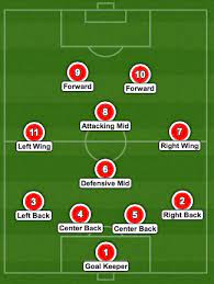
As shown in the football lineup below, players from one team are arranged close to one another on one end of the pitch and those from the opposing team are arranged on the other end.
The closeness of positions between teammates enables humans to tell between the two opposing groups.
This lineup structure is a customary practice in football and an integral aspect of the gameplay’s tactical planning.
5. Web Design

Lastly, Gestalt’s law of proximity also features heavily in contemporary website design discourse.
In particular, proximity arrangements are commonly used to arrange the different sections of a portal’s layout.
For instance, Twitter uses proximity arrangements to differentiate the various content categories of a tweet.
The lines shown in the example above highlight the different content enclosures included in a tweet.
These proximity arrangements make it easier for web users to better internalize the tweet’s contents and layout.
Case in point, the ‘likes’ icon is strategically placed close to its respective number in a manner that indicates the relationship between the two elements.
It is a similar case for the hyperlink and comments sections of the tweet.
User identification elements, such as the avatar and username, are also arranged closely in a group at the top, while the date and time elements are also grouped together below the tweet.
Summary
By and large, Gestalt’s law of proximity is one of the most commonly used principles of Gestalt’s theory.
This law holds that humans perceive objects placed close to one another as belonging to one group.
Consequently, this proximity perception enables people to infer specific meanings to distinct arrangements or patterns.
Some of this principle’s most notable real-life applications include football lineups, braille, web design, the IBM emblem, and automobile interface designs.

